New Navigation
Using a combination of Scentsy specific usability research and Baymard's e-commerce guidelines I explored Scentsy's category taxonomy and navigation experience. I presented a list of risks and mitigations for each solution and provided "Guiding principles" to help present the solution. This gave us the opportunity to solve the scalability issue while addressing a problematic experience shown through usability testing stemming from the different experience with the accessory navigation between mobile and desktop.
Using a combination of Scentsy specific usability research and Baymard's e-commerce guidelines I explored Scentsy's category taxonomy and navigation experience. I presented a list of risks and mitigations for each solution and provided "Guiding principles" to help present the solution. This gave us the opportunity to solve the scalability issue while addressing a problematic experience shown through usability testing stemming from the different experience with the accessory navigation between mobile and desktop.
Guiding principles
User centric mental models and naming – “Is this what a customer would call this?”
Customer intent – “What is the customer trying to accomplish?”
Findable and discoverable – “Can a user with a specific product in mind know what category it’s under without clicking on it? Can they be exposed to similar products they didn’t think about?”
Simplicity – “How long does it take to reach my end goal?”
Does it translate? – “How does this work on mobile, desktop, screen readers for visual impairment, and in other languages?”
Data-driven design decisions – “How do Scentsy customers expect to use this and how will that change over time?”
Flexible and scalable – “Can it accommodate new products well?” This is a living thing but should be able to adapt without being overhauled.
Scentsy's Old Header

Scentsy's old navigation in the header - Problematic horizontal navigation does not lend itself to expandable product lines.
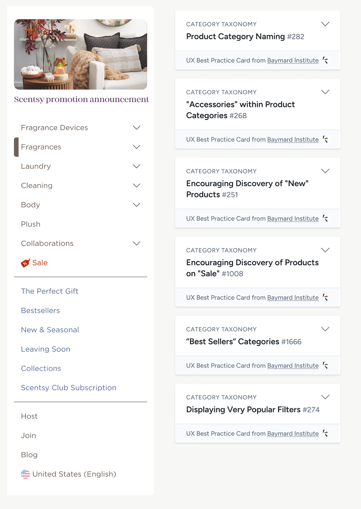
Scentsy's New Header

New header is cleaner, takes up less vertical space and provides similar experience to mobile navigation.